How I’d Design It: Five move-in ready apartments on the New York market (the Fall 2024 edit)
On the market: 160 Imlay St. #3B2 | Brooklyn, New York
After such a positive response from my readers, I’m back with the Fall edition of the How I’d Design It series: I take a slice of properties currently on the New York real estate market, and share my interior design recommendations for each unit.
Last time, I covered five one-bedrooms in Lower Manhattan. For the current edit, I’m expanding to some slightly larger spaces and taking a swing into Brooklyn too.* Time & Place Interiors focuses on furnishings, finishes, styling, and art curation more than on renovation, so I’ve once again selected units that have been recently updated (some in historic buildings - my favorite!) or are new builds. Each is move-in ready and deserves polished interior design.
If you’re thinking of laying down roots in a New York apartment and are overwhelmed by the prospect of making it feel like home, remember that a designer can help you settle in more efficiently and with better looking results. Meanwhile, enjoy imagining how you’d live in one of these amazing NYC digs.
- Ksenya, founder of Time & Place Interiors
*as of Fall 2024
Soho: 170 Mercer Street #5E
Price: $2,175,000
What I like about it:
Who doesn’t dream of a Soho loft with18-foot ceilings? This one comes with a wood-burning fireplace, a skylight, Subzero fridge, and a freestanding soaking tub alongside a spa shower. The lofted bedroom overlooks the airy living room, and the mantle rises dramatically to the ceiling. I love how the sleek kitchen has an extra long, continuous island surface extending from the cooktop to the eating area under three tall lights. Pinch me.
How I’d design the space:
Open spaces need designated areas of furniture: intentional conversation areas like a lounging area, a dining set, and perhaps a cocktail bar in a corner. These can be demarcated by leaving breathing space in between sections, and through select placement of rugs to create visual boundaries. The existing glass ceiling pendants here are beautiful, and call for a roomy table below. If my client was amenable to the aesthetic, I’d suggest a Post-Modern approach here, with a mix of iconic and striking contemporary furniture. A bold antique, mixed in among modern design, wouldn’t be out of place here either.
Even more important to this loft would be great quality original art scaled proportionally to the large wall space. A sculpture, or a pedestal with a tabletop sculpture on top, would also round out the open space. (A statement floor lamp can also be functional art too, by the way.)
This unit’s floors were intentionally left unfinished, for the next homeowner’s choice of customization. I’d keep them as-is, with only a clear finishing coat, to emphasize the warm natural wood in juxtaposition to the striking steel fireplace hearth.
Red Hook: 160 Imlay Street #3B2
Price: $1,450,000
What I like about it:
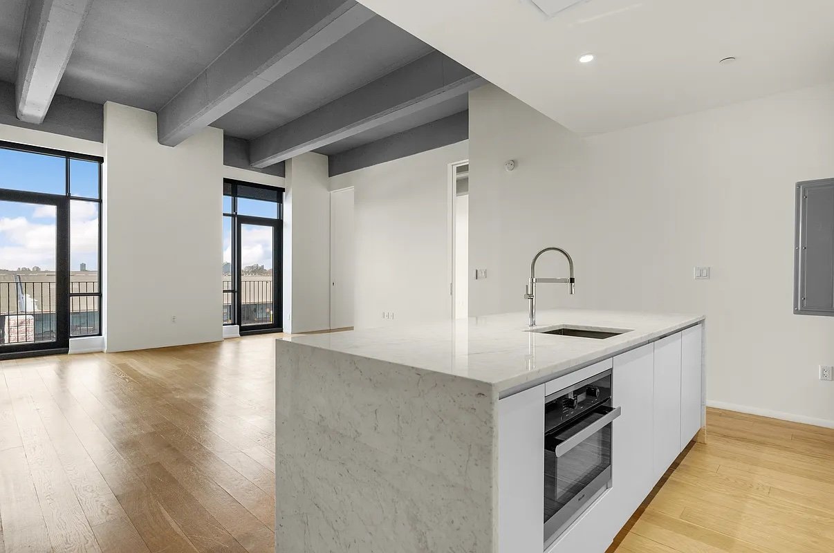
The best buildings in the city date back in time. This unit is a converted residence in the historic New York Dock Building from 1910, overlooking the New York Harbor. It has grand proportions, 12 foot ceilings, and cool post-industrial beams. Savor the industrial dock views of the Harbor, the Statue of Liberty, and the Manhattan skyline, and then head out to explore Red Hook, one of Brooklyn’s most vibrant artistic neighborhoods. (Nearby Sunny’s Bar, dating to 1890, is one of my favorite live music joints.)
How I’d design the space:
The epic harbor view, ceiling beams, and a giant concrete column command attention and provide an incredible background for interior design. I suspect this unit is in the same building as the one that AD100 designer Robert Stilin recently designed as his own home. So I can’t help but take inspiration from his limitless talent to outfit the space with an eclectic mix of vintage furniture that leans into the 1950s, 60s, and 70s, with an emphasis on European Mid Century design.
I’d take advantage of the separate entry that welcomes you before revealing the grand view by arranging a proper foyer setup, with a beautiful console table, mirror, lamp or sconces, and perhaps a stylish stool or bench.
It looks like the electrical box is in a visible spot across from the kitchen, so I’d cleverly hang an artwork over it to hide the panel. And if there’s one cosmetic change I would make, it would be to paint the baseboards so they match the color of the walls: uniform color tends to accentuate the sensation of height and modernize the effect.
Chelsea: 515 West 18th Street #217
Price: $2,475,000
What I like about it:
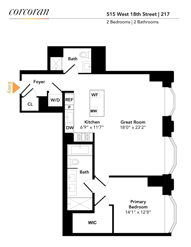
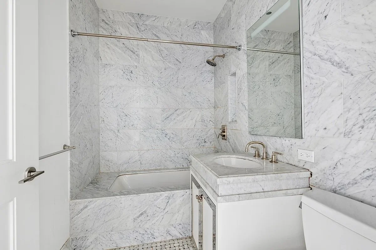
I always appreciate new construction with intriguing architecture. In this innovative building off of the Highline, the slanted bay windows evoke old time character, but with a modern twist. The kitchen’s fluted millwork, curved cabinetry, and bronze finishes feel luxurious, as do the baths’ high end finishes. Spread out with an extra guest room, or keep your home office tucked away in a separate space. For blowing off steam after work, head to the pool, sauna, or yoga room on premises.
How I’d design the space:
The bay windows here call for a cozy reading nook, with a lounge chair + ottoman or even a chaise lounge lined up with the window view. The windowsills are conveniently deep enough to hold books and drinks.
The statement style of the open kitchen should guide the aesthetic of the living room, with sufficiently high quality materials and sophisticated design. Some curves in the furniture would echo the lines of the cabinetry. A contemporary, sleek approach makes sense in this space, with its clean architectural elements.
There’s a decent amount of hallway space in this unit — the first leading from the front door, and then another past the two bedrooms. It would be smart to make good use of these transitional but significant hallway spaces with space-saving design in the entry, as well as a cohesive approach to the back hall so that it doesn’t feel like an empty oversight.
Gramercy: 225 East 19th Street #102
Price: $1,995,000
What I like about it:
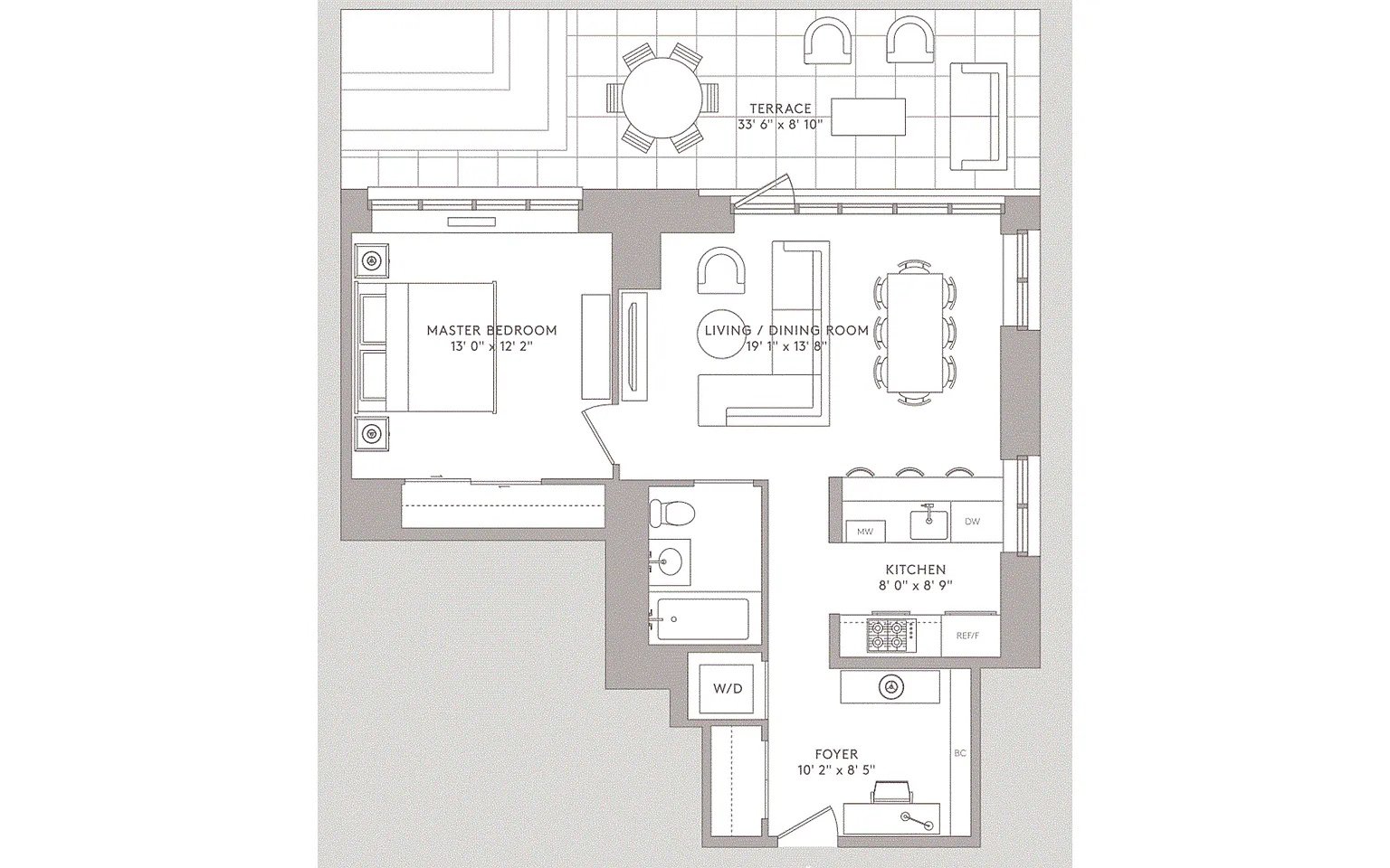
Imagine a classic 1930s New York Pre-War facade, and then having your own modernized unit on the inside, with floor-to-ceiling windows, central air, and luxury appliances. Best of all, this spacious 1-bedroom comes with your own private outdoor space. I love the 12 foot ceiling and the classic marble in the kitchen and bath. The apartment is part of a complex of four buildings wrapped around beautiful outdoor gardens — always a welcome respite from busy city life.
How I’d design the space:
There’s enough of a blank slate feel to this space for flexibility of nearly any furniture style. However, I’d lean towards a tastefully eclectic mix of modern and a few antiques to jive with the classy architecture and marble finishes. An elegant sideboard, a comfortable club chair, and a beautiful vessel on the counter would make sense here.
To max out the space for the living room, you could keep the eating area to a minimal footprint — either with a small dining area consisting of a bistro table plus a couple of chairs, or even omitting a table altogether and just using the counter seating.
I’d take full advantage of the 33 foot private terrace by bringing in a landscape designer for plants that look good year-round, to be seen from the patio itself as well as from behind the full glass wall in the living room.
Flatiron: 55 West 17th Street #304
Price: $1,995,000
What I like about it:
This place isn’t just airy and bright; it’s also modern and comfortable. It has 9 foot ceilings and enough common space for both a living room layout plus a dining table. The walk-in closet is a haberdasher’s dream. And you’re already set up with a built-in unit for entertainment, plus a wine fridge in the kitchen peninsula. Cool down in summer with central A/C and a rain shower, and head to the landscaped terrace where you can grill for your friends. Renting a car for the weekend? There’s parking in the building.
How I’d design the space:
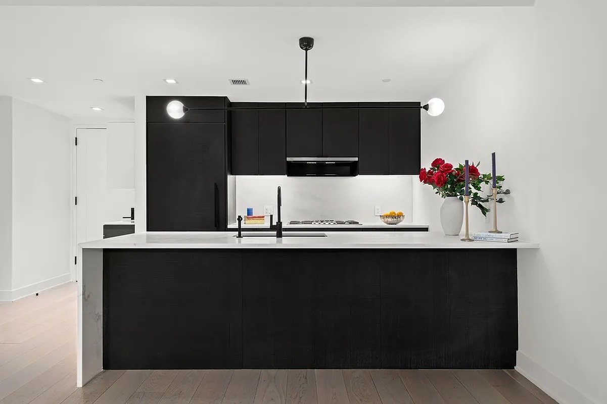
If the existing pendant light above the kitchen is kept in place, it would be best to coordinate the aesthetic around this statement fixture, keeping the design style minimal, with some Mid Century vintage pieces. Counter stools in a light wood finish would contrast nicely against the black oak cabinetry. To warm up the kitchen, you could place a distressed vintage Persian runner rug— perfectly sturdy enough to withstand foot traffic and absorb spills.
There’s no existing hardwire electric connection in the ceiling of the common area, so I’d employ a plug-in wall sconce with far-reaching pivoting arms along the right wall, where a dining set would go, so that the table has illumination above it. I’d also place a table lamp in the built-in unit, for balanced lighting on the opposite end of the room.
The spacious walk-in closet deserves dressing up, with a decorative rug, to make this intimate space feel more personal. And the hardware on the built-in units in the common space as well as the main bedroom deserve close inspection: a swap of cabinet pulls can go a long way for adding a classy feel to a new build unit.
Make settling into your new space feel seamless.
Time & Place Interiors offers residential interior design services for young New Yorkers seeking fresh vibes. Founder Ksenya Malina brings full service furnishings, styling, and art direction using her signature combination of vintage + modern designs. To explore working together, use the link below to schedule a free 20-minute information call with Ksenya to discuss your design needs:

